
Your Website
Brand identity
Your logo, favicon, tagline, five brand colours, font style and button shape — the layer that makes a template look like your shop.
Brand Identity is what turns a template into your shop. It applies to whichever design you chose, so you can switch templates later without redoing any of this.
Where to find it: menu → Website → Website Builder → Brand Identity tab.
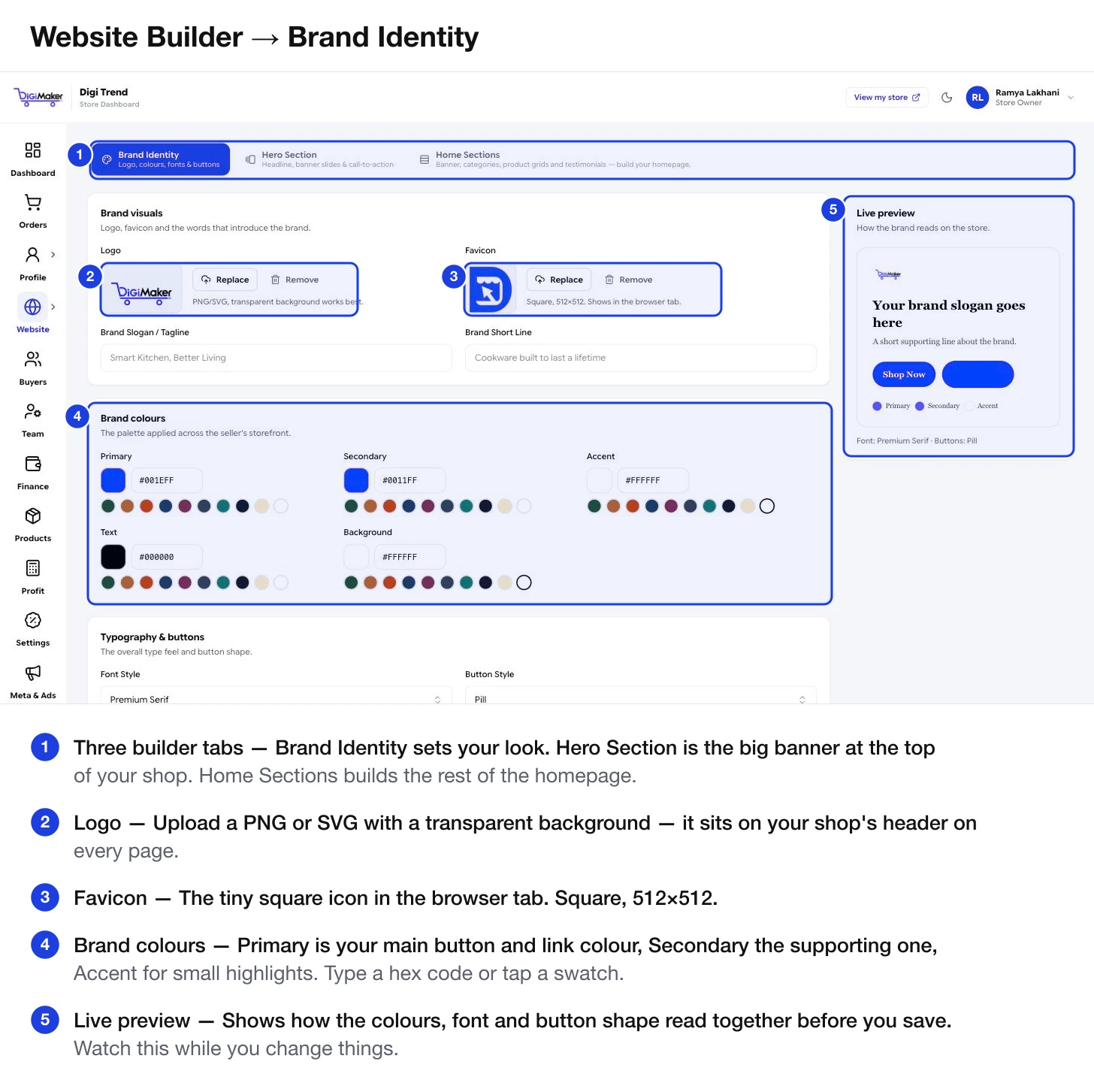
Brand visuals
| Field | What it is | What works best |
|---|---|---|
| Logo | Sits in your shop’s header on every page. | PNG or SVG with a transparent background. A white box around your logo will show. |
| Favicon | The tiny square icon in the browser tab. | Square, 512×512. Usually a symbol or initial rather than the full wordmark — it renders about 16 pixels wide. |
| Brand Slogan / Tagline | A short line that introduces the brand. | Five to eight words: “Smart Kitchen, Better Living”. |
| Brand Short Line | A supporting sentence under the tagline. | One line about what you actually make. |
Brand colours
Five colours, each with a hex code box and a row of ready-made swatches you can tap.
| Colour | Where it shows |
|---|---|
| Primary | Your main buttons and links. The colour buyers associate with your brand. |
| Secondary | Supporting buttons and accents. |
| Accent | Small highlights — badges, small icons. |
| Text | Body text colour. Usually near-black. |
| Background | The page background. Usually white or a very light tint. |
Take one strong colour from your product photos and use it as Primary. Leave Text near-black and Background white. Two colours done well beat five done badly.
Each colour has a row of pre-chosen swatches underneath — greens, terracottas, deep blues, plums, teals, near-blacks, creams and white. They are picked to work together, so choosing from the same column across rows gives a coherent palette without any colour theory.
If your printer or designer gave you a code like #1E3FE0, type it straight into the box. Include the #.
Typography & buttons
- Font Style — the overall type feel. Premium Serif reads traditional and considered; the sans options read modern and plain. Pick what fits what you sell, not what you personally like reading.
- Button Style — Pill (fully rounded), or squarer alternatives. A small choice that changes the whole feel more than you would expect.
The live preview
The panel on the right shows your slogan, a supporting line, a Shop Now and a secondary button, and dots for your three main colours — all rendered in the font and button shape you have chosen. It updates as you type.
Use it. It is far faster than saving and reloading your shop each time.
Saving
Save brand identity at the bottom applies everything to your live shop immediately. Then press View my store in the top bar to see it in place.